Lovable.dev Themes that don't look generic
Drop-in design systems for Lovable. Semantic HSL tokens, typography pairs and component variants — built to Lovable's exact stack so they just work.
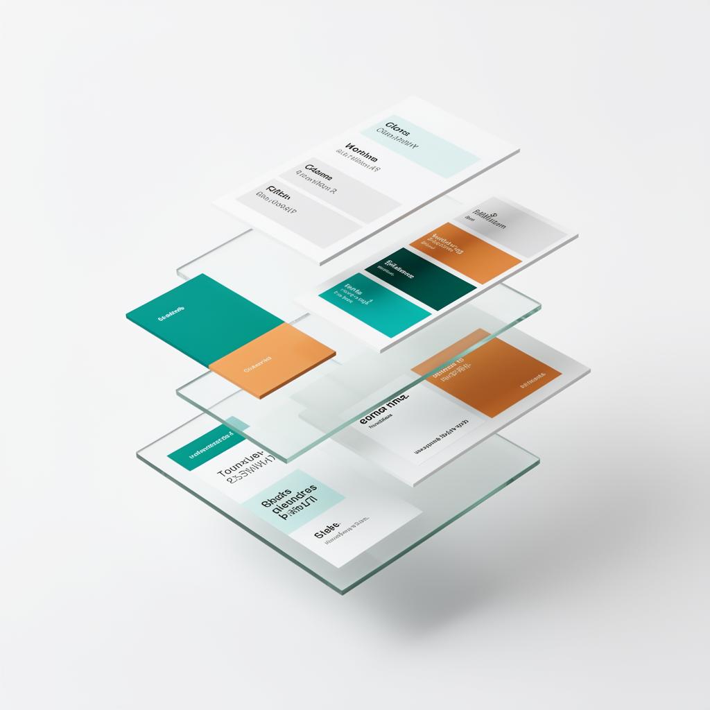
Six themes. One drop-in.
Every theme ships semantic tokens, light + dark variants, typography and a matching component set. Paste, restyle, ship.
Bundle all six themes for £99 — Theme Library Pass
From download to restyled in five minutes
Download the theme
Get index.css, tailwind.config.ts and a typography snippet.
Paste into your Lovable project
Replace the matching files. Lovable picks the new tokens up instantly.
Customise
Tweak two or three tokens to match your brand. Done.
Questions, answered
How does a Lovable theme actually work?
Each theme is a drop-in design system: index.css tokens (HSL), tailwind.config.ts colours, semantic component variants and a typography pair. Paste it into your Lovable project and every component restyles instantly.
Do themes break my existing components?
No — they only replace tokens. Your components keep using semantic classes like bg-primary, so they pick up the new theme automatically.
Light and dark mode included?
Yes. Every theme ships balanced light and dark variants out of the box.
Can I customise after applying?
Absolutely. Themes are a starting point — every token is editable. Many users tweak two or three colours and call it done.